
This project was a program planned for St. Edward University’s Symposium On Undergraduate Research and Creative Expression (s.o.u.r.c.e.) conference. The symposium is an annual event on campus that showcases student research, presentations, and speeches ranging from all colleges within the school. The program made is 70 pages long total, front and back covers included, and was to be printed on newsprint paper with RISOgraphic ink.
Beginning the Book
(Cover and Interior Drafts)
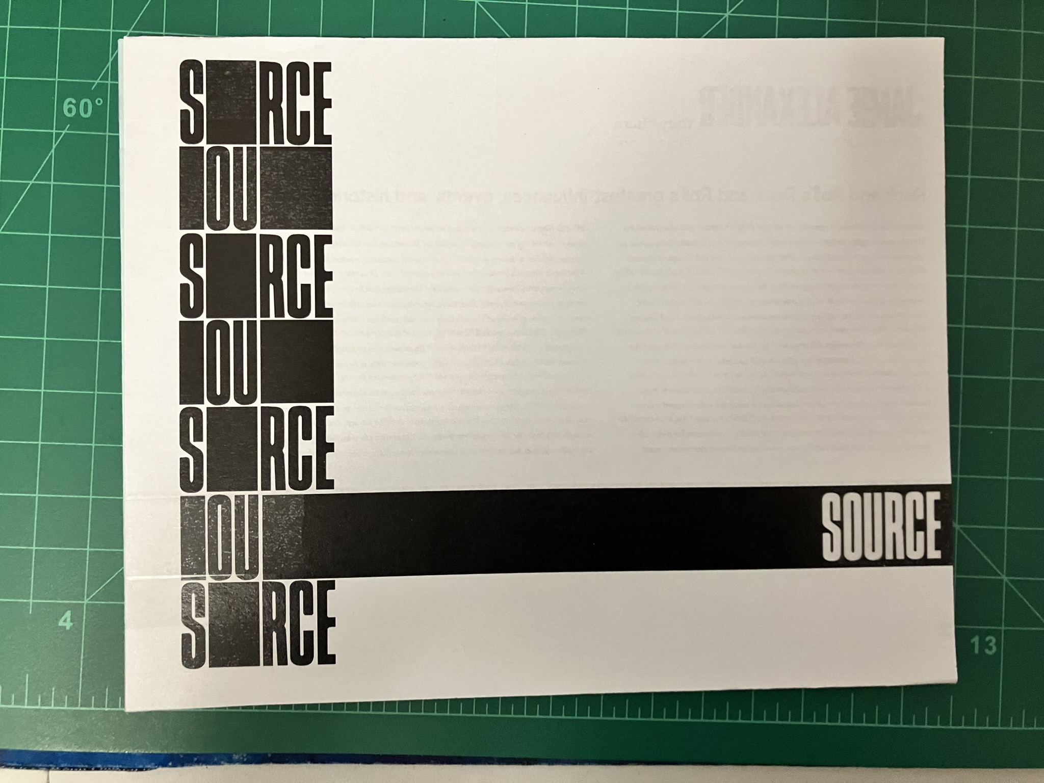
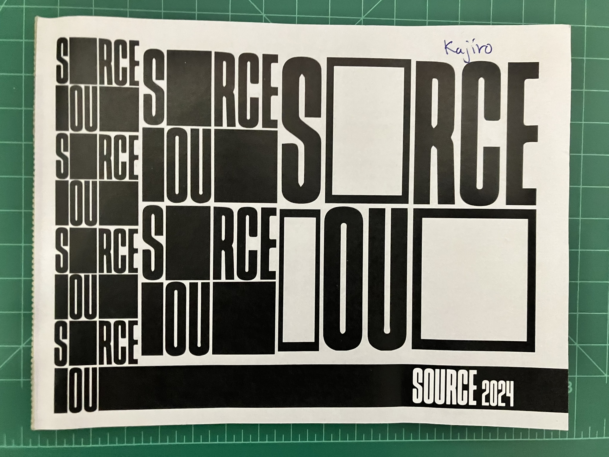
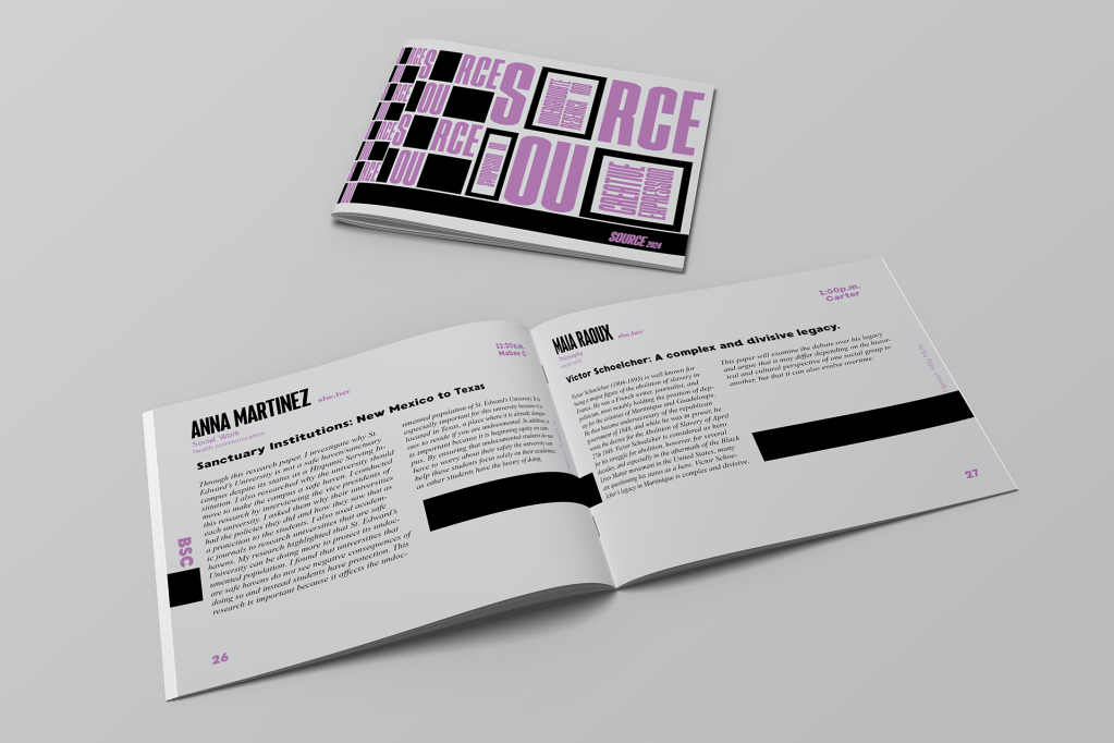
There were many iterations of the front cover made, but none stuck out more than the combination of letters and bold blocks, imitating a checker pattern. Originally the entire book was going to be printed in black and white, since a limited number of colors were made available in the scope of the project. Purple was added a little while later after many paper mockups had been made, and so the combination of black and purple ink on light gray paper proposes a formal aesthetic.
Inner Pages
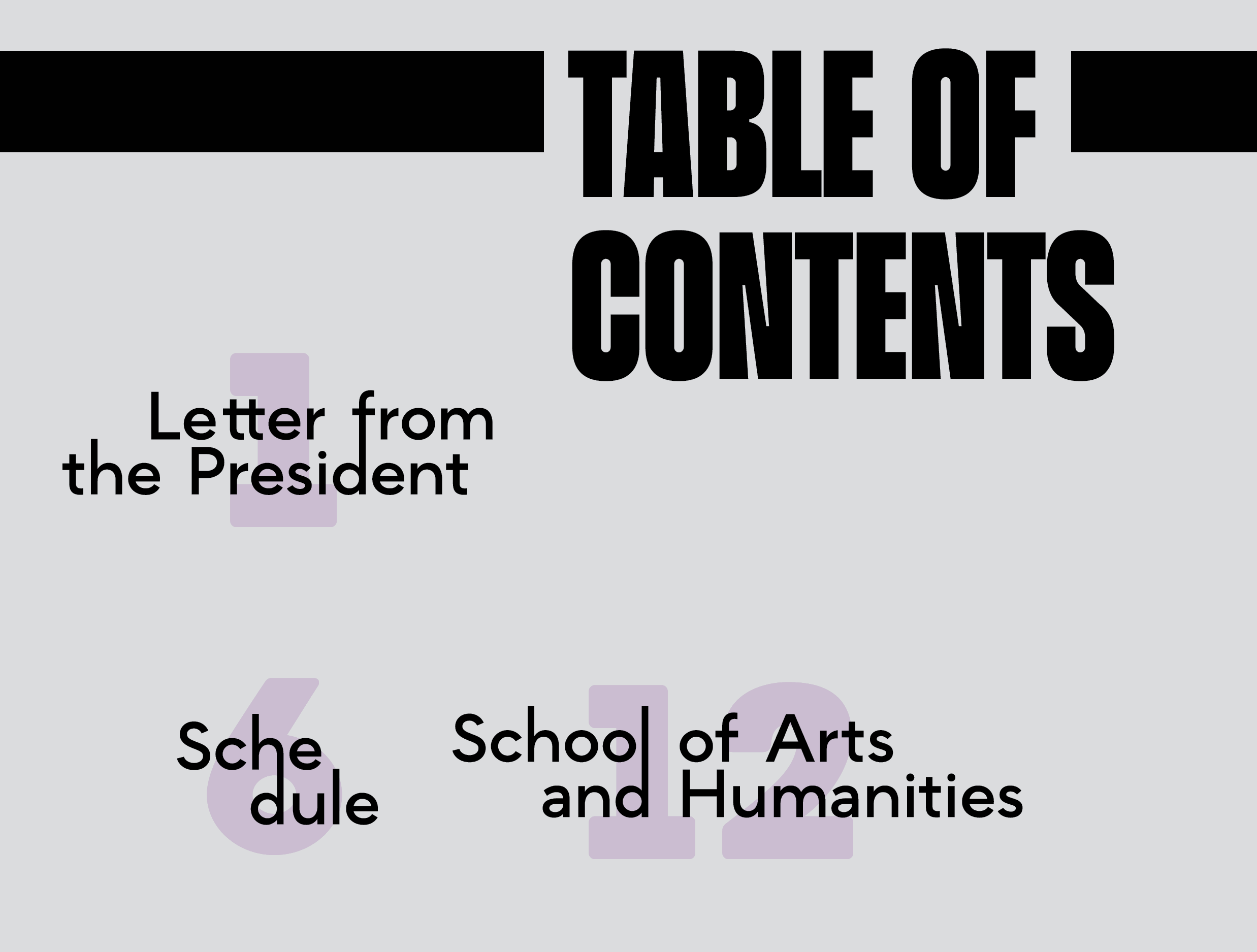
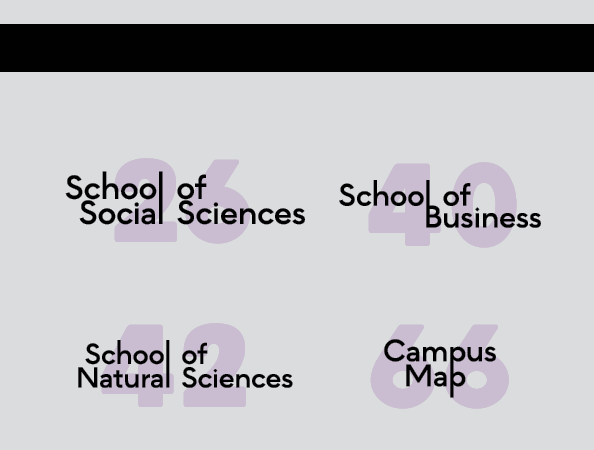
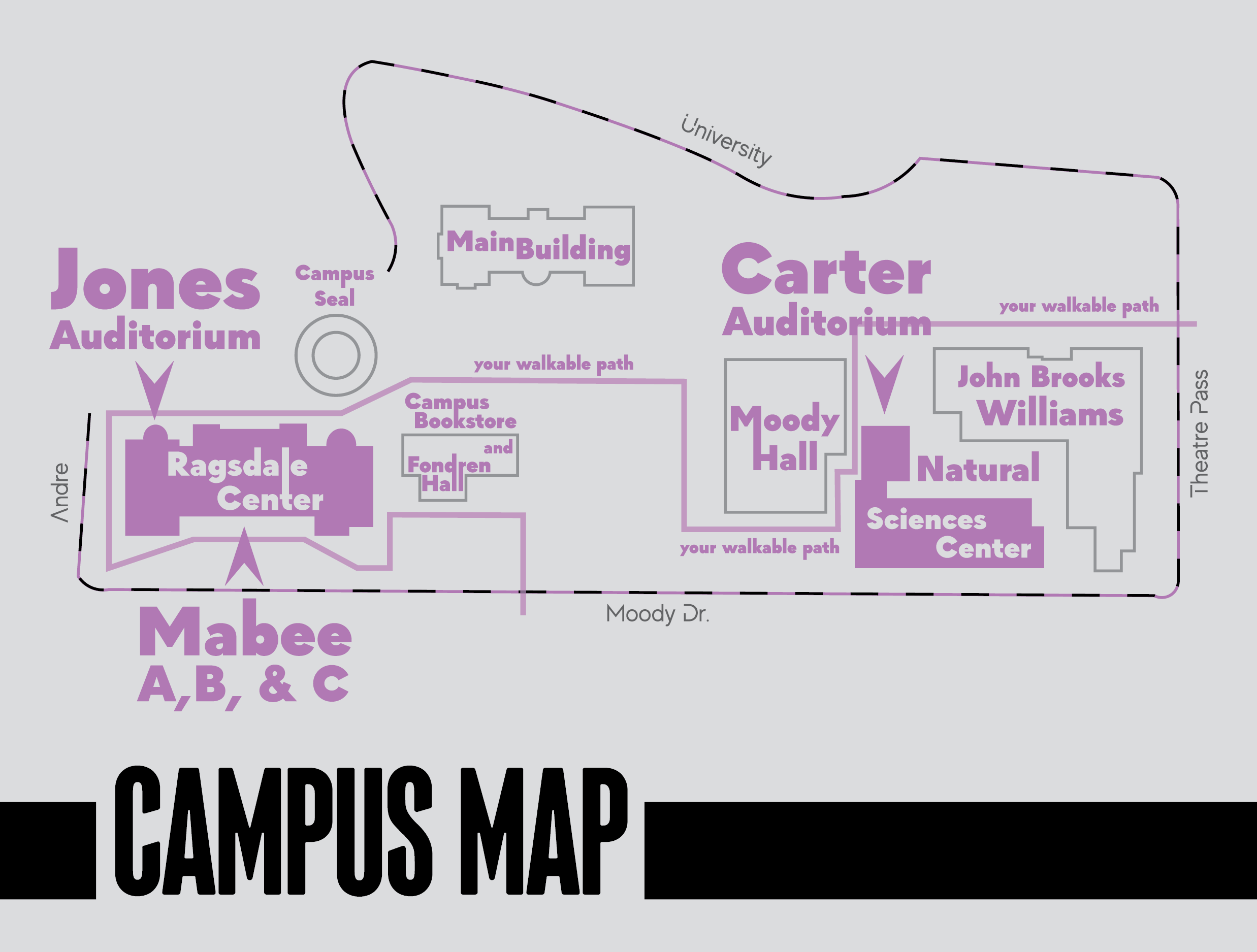
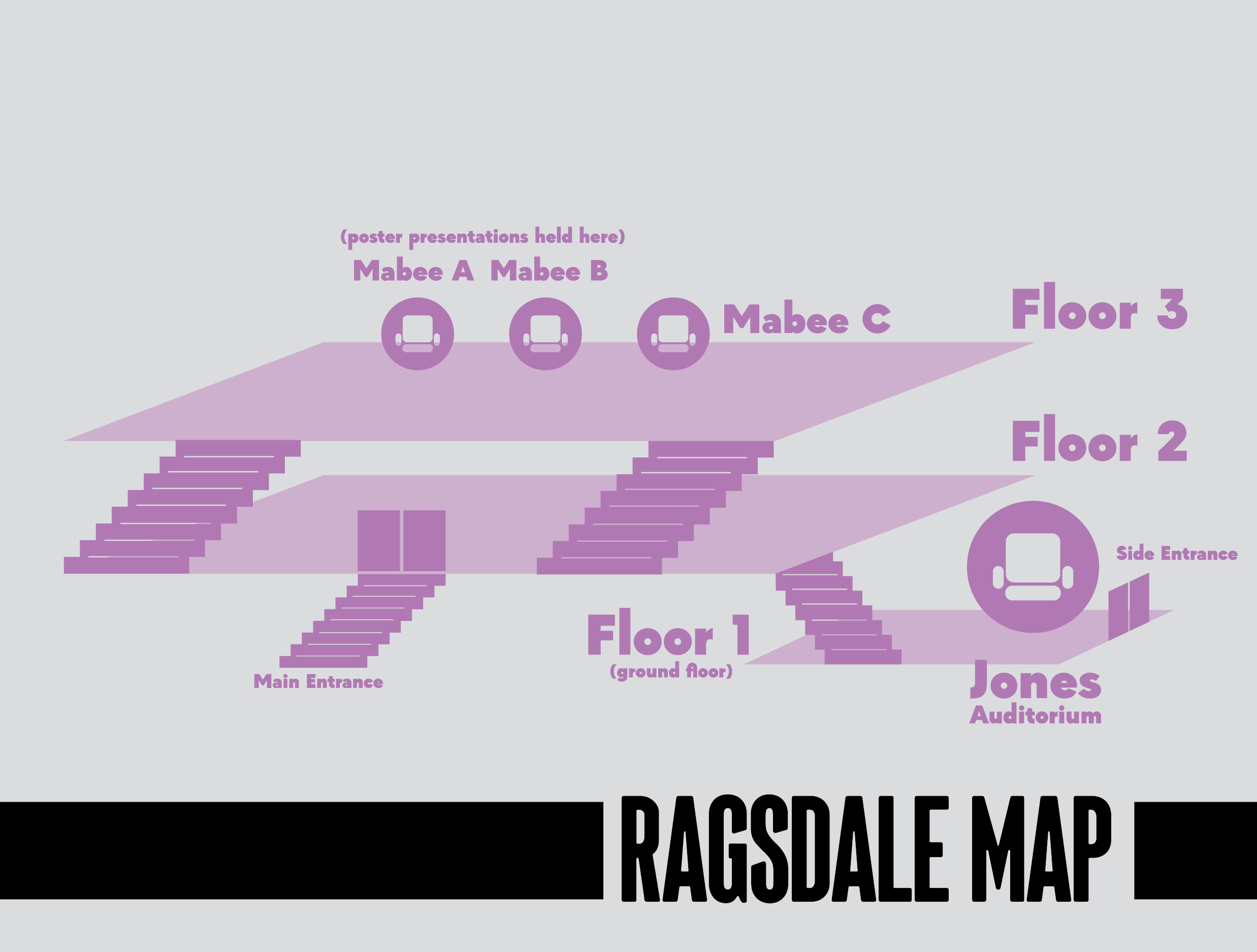
Key graphics/pages that were required in the program included a letter from the president of the university, a table of contents, a schedule for all presentations, campus and building (Ragsdale Center) maps, and a special thanks page at the very end. Wayfinding is an important element for visitors unfamiliar with the campus layout, so I utilized iconography and sans serif fonts to help with the ease of readability.
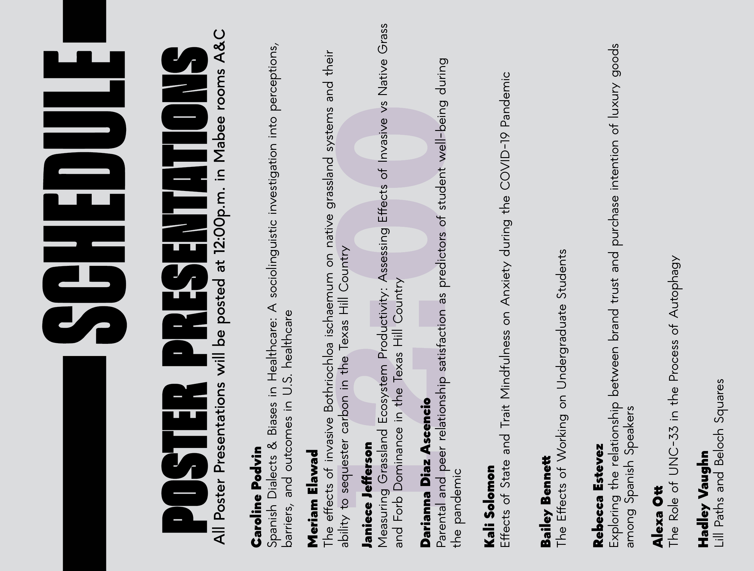
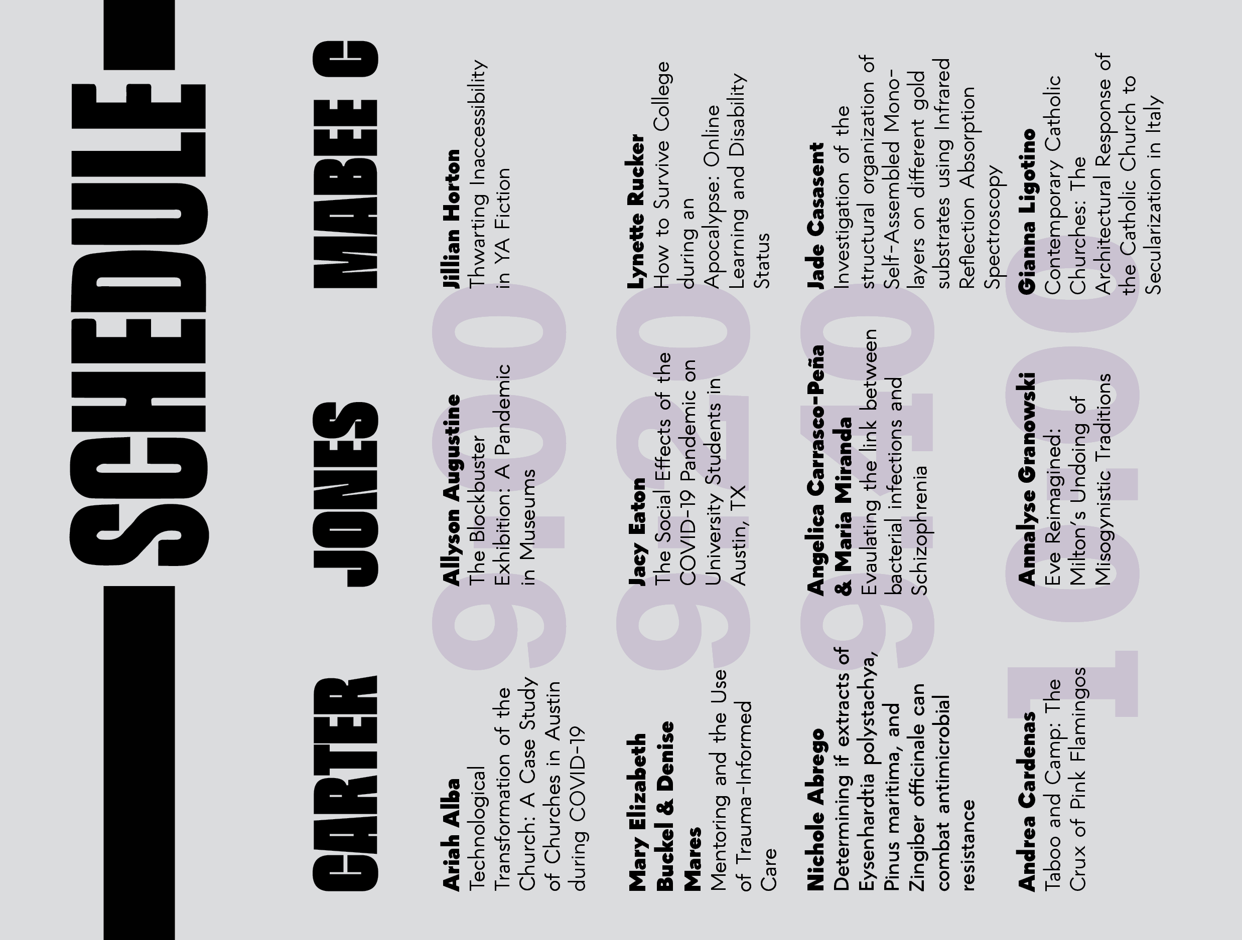
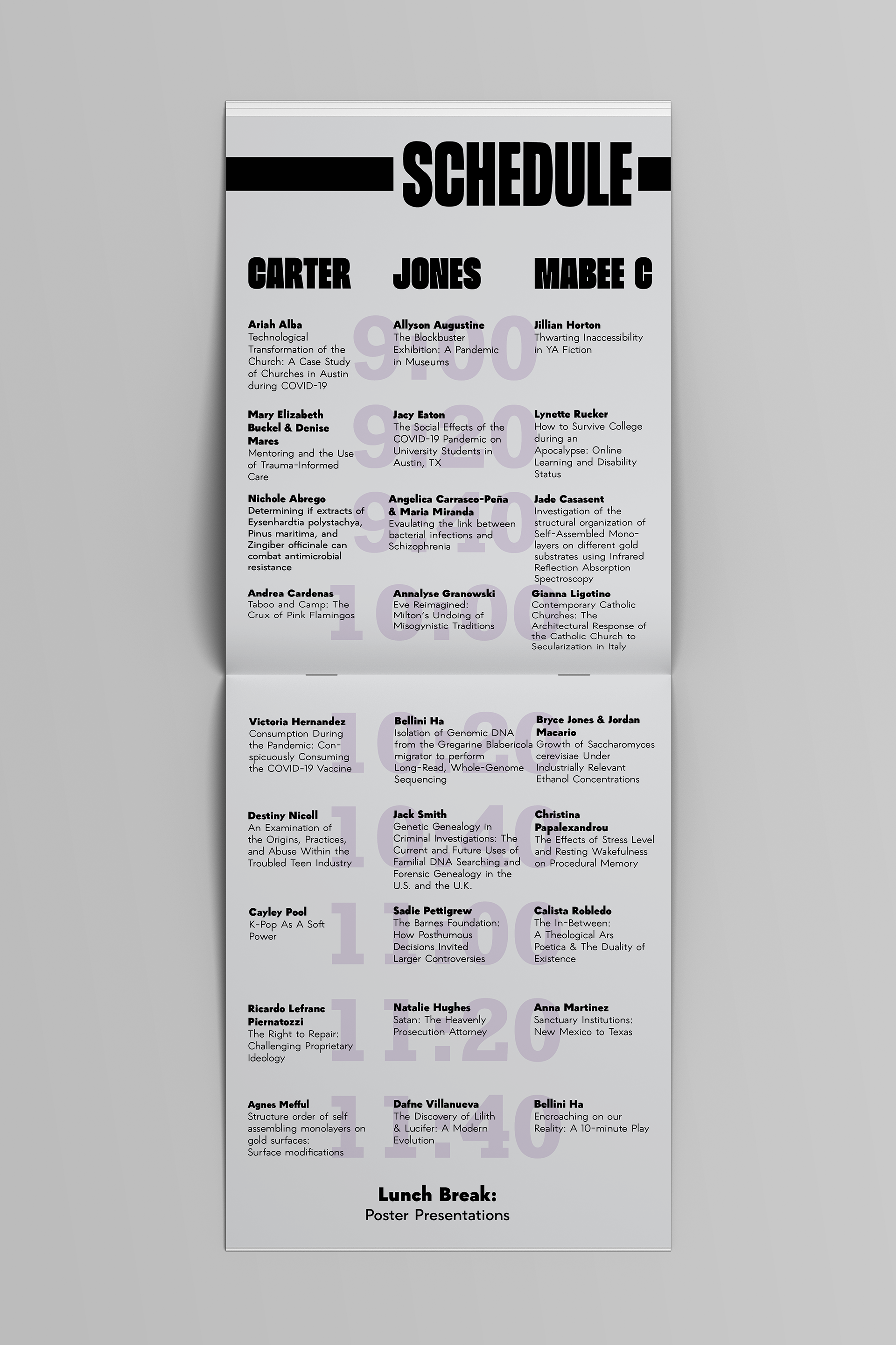
As shown here, the schedule is best read when the program is turned on its side, resembling a notepad. This was a way to fit everyone’s presentations on a fewer number of spreads, and a way to keep every presentation in every corresponding location in just one column. This was one of the ways that the horizontal format of the book served as more than just experimental, but also convenient.
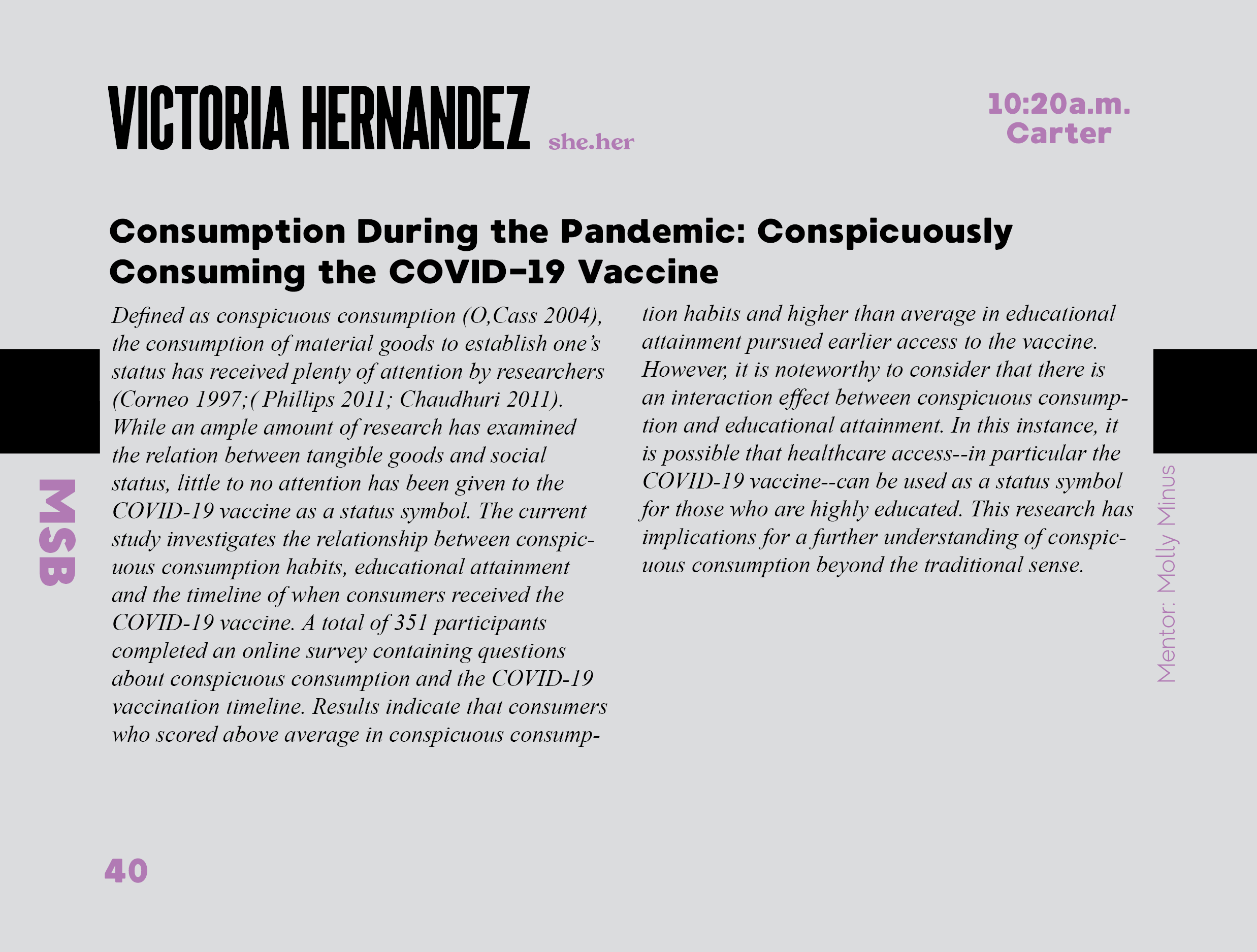
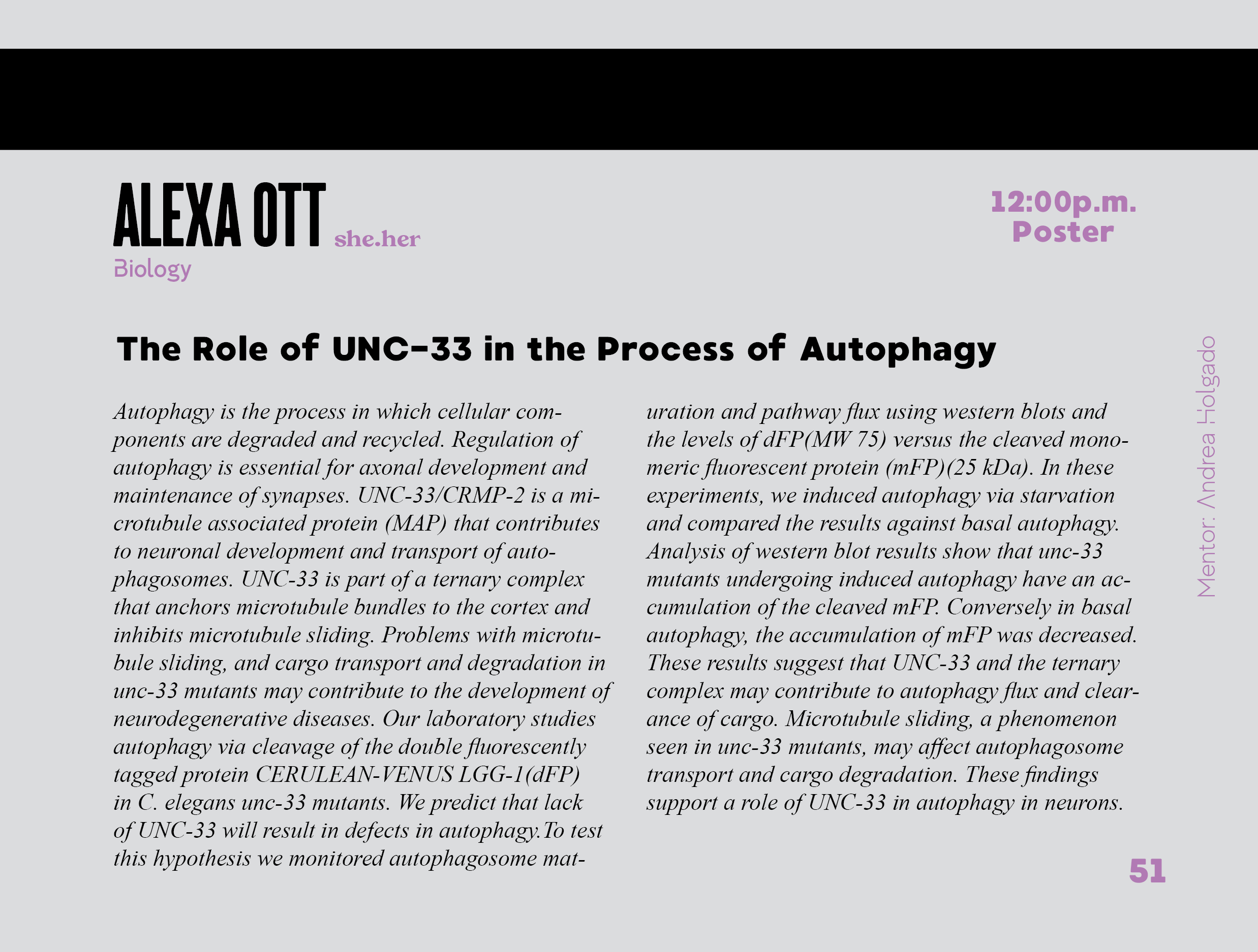
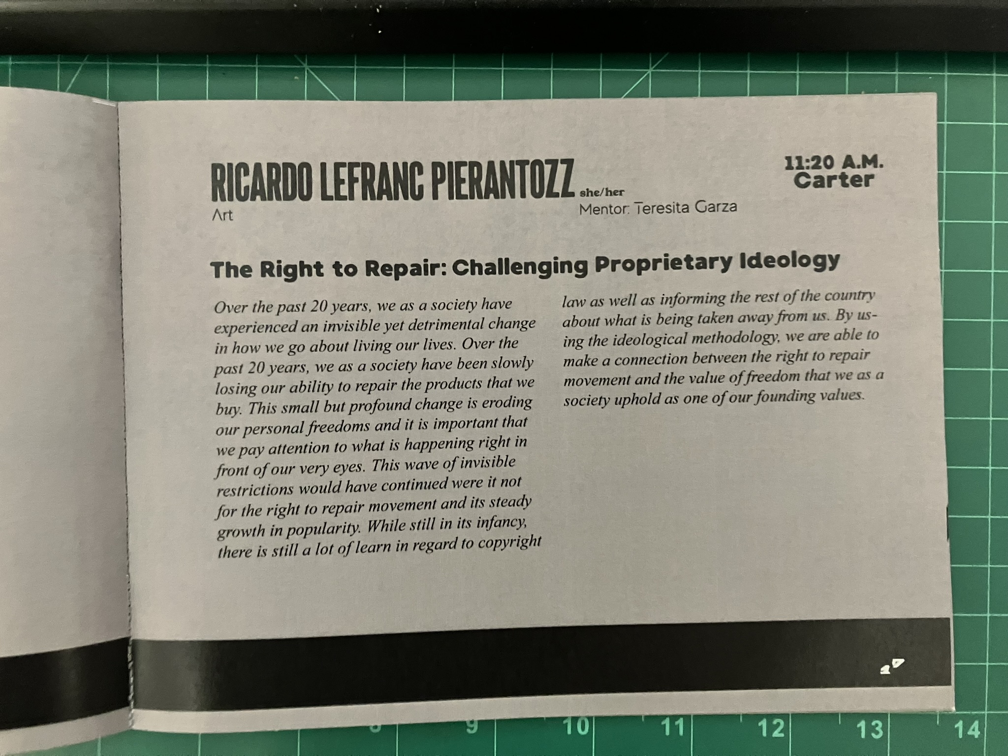
Shown above are spreads with information about the student presentations. Their name, pronouns, major, and minor (if applicable) are at the top left of their pages. The time and location of presentation are in the top right, and the title with a thesis summary make up the body text. On the right sides are their mentors, and on the left side of the left page is their respective college.
Each college has an abbreviation; AHMX stands for the School of Arts and Humanities, BSC stands for the School of Behavioral and Social Sciences, MSB stands for the school of Business, and NSCI stands for the school of Natural Sciences. The bar going through them sections off the book in blocks along the fore edge, and is also a part of the way to identify which college they are coming from.
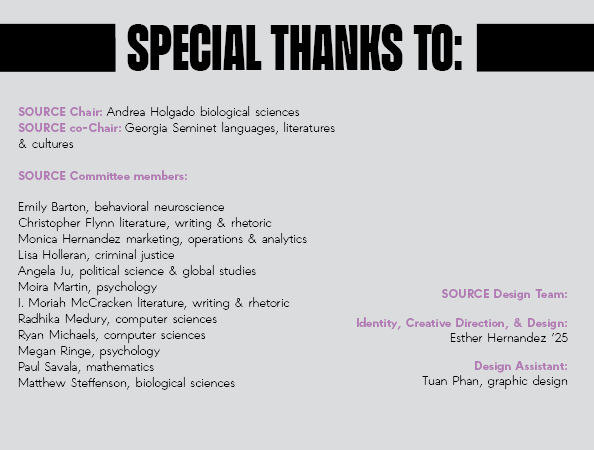
In the very last pages of the program are the special thanks, which was an important part of the project as it named the committee members and gave credit to the creator of the winning design.
The work was intense, as this was one of the first long-term projects I took on. In experimenting with page layout, typography, colors, and iconography, I feel that I gained a lot of printing and mockup making experience, and it ultimately pushed me towards printed products as a design niche.
