The Twin Oaks Library identity project was a semester-long brand identity assignment done for a local library branch of Austin. This branch in particular is a library in the heart of a middle class South Austin neighborhood, mostly populated by families with children and pets. The project lasted from January 2024 to May 2024, and concluded with a formal class presentation.
Research
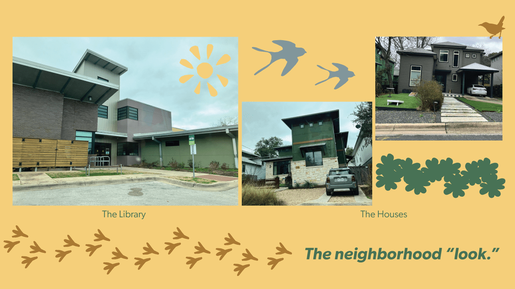
The first part of the project included extensive amounts of research. Looking up information about this library branch online, interviewing patrons, employees, and volunteers, and even photo documentation were part of the research process. The pictures in the “the neighborhood ‘look’” slide are of the library and a couple of the houses in the neighborhood. The library fit so well into the community that it resembled the surrounding architecture almost identically.
Brand Elements
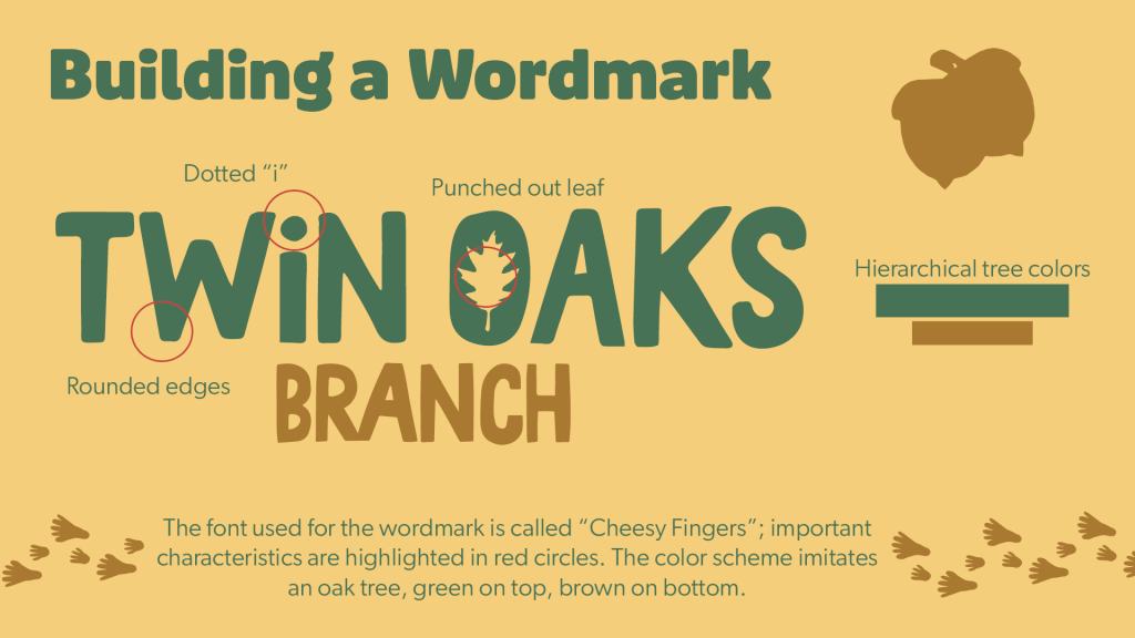
Wordmark information as shown in this slide indicates intentionality in every little detail, including in the hierarchy of the words.
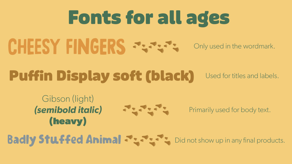
After a lot of in-depth research, the identity of the library was built as straightforward as possible: playful, simplistic, organic, friendly, and colorful. The wordmark had a number of changes made to the original font, Cheesy Fingers, in order to fit the playful and friendly feel. A dot over the “i” and a leaf punched out of the “o,” along with the color hierarchy of a tree, made for the biggest and most important changes. The fonts used were also meant to be fun, with soft, rounded edges (for the most part), and nothing too fancy or hard to read. All type had to be accessible to readers of all kinds.
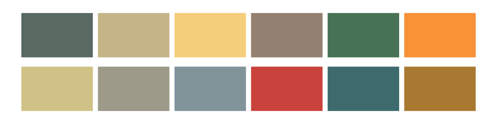
(Brand Colors: Oak, Cool Rock, Sunshine, Boulder, Grass, Tangerine, Pale Gold, Cloudy Skies, Aqua, Cherry, Pine, Earth)
Font choices and their individual uses.
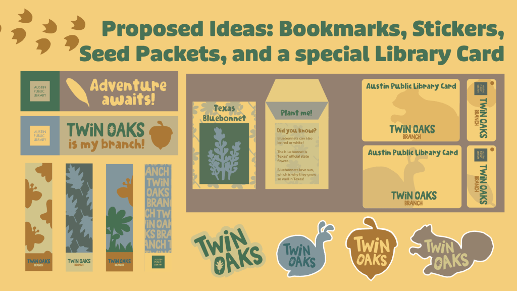
The simplistic graphic elements as seen above were hand-drawn and cut out to make the shapes feel more organic, just like the aesthetic of the brand. The rough edges and awkward angles make the shapes and figures less serious and more artistic. After drawing and cutting out the shapes, they were scanned and vectorized, with the exception of the proportionally accurate oak leaf that was used in the wordmark. Plants and animals litter much of the aesthetic, and were used in all kinds of proposed brand material.
Brand Materials
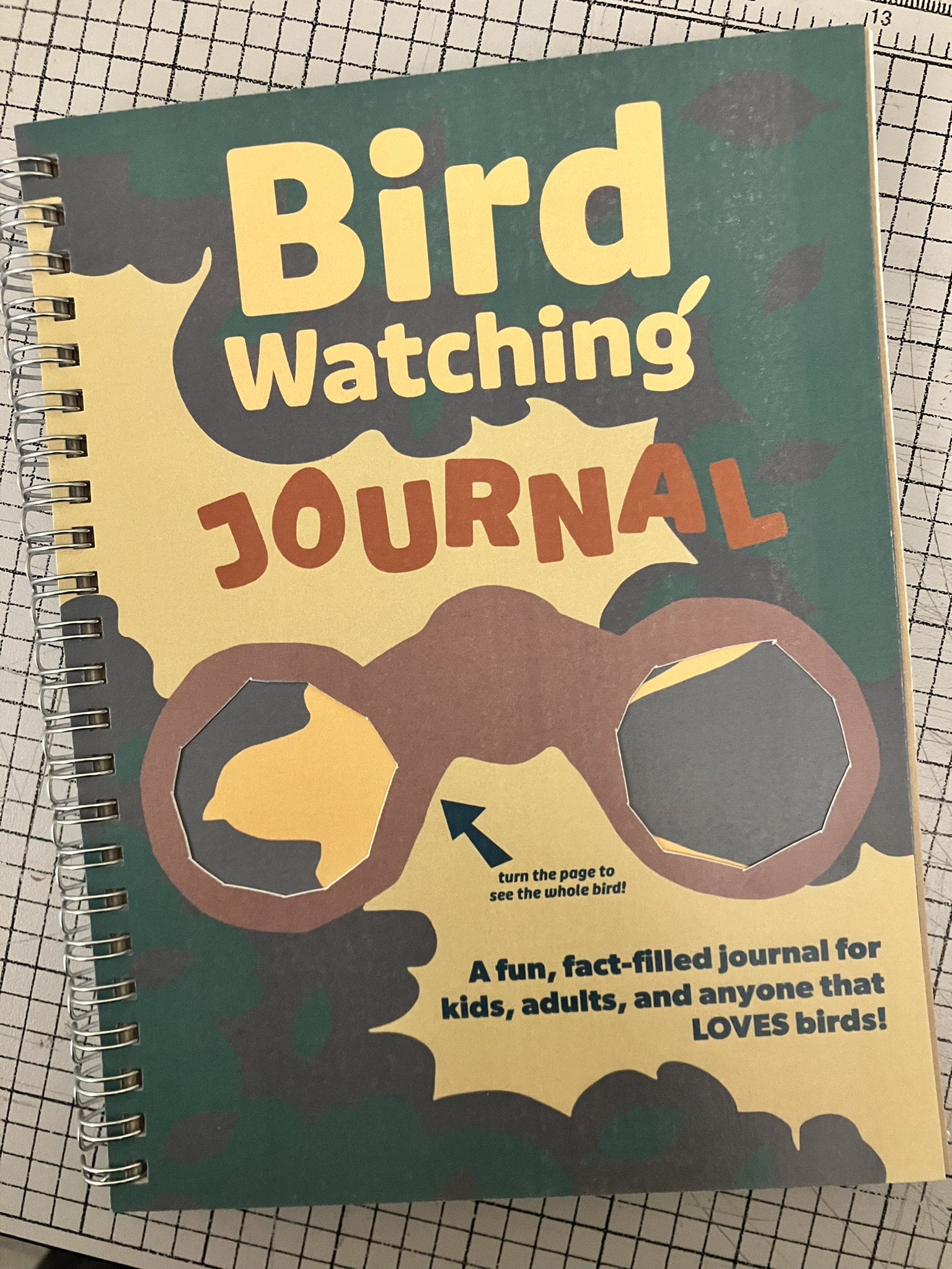
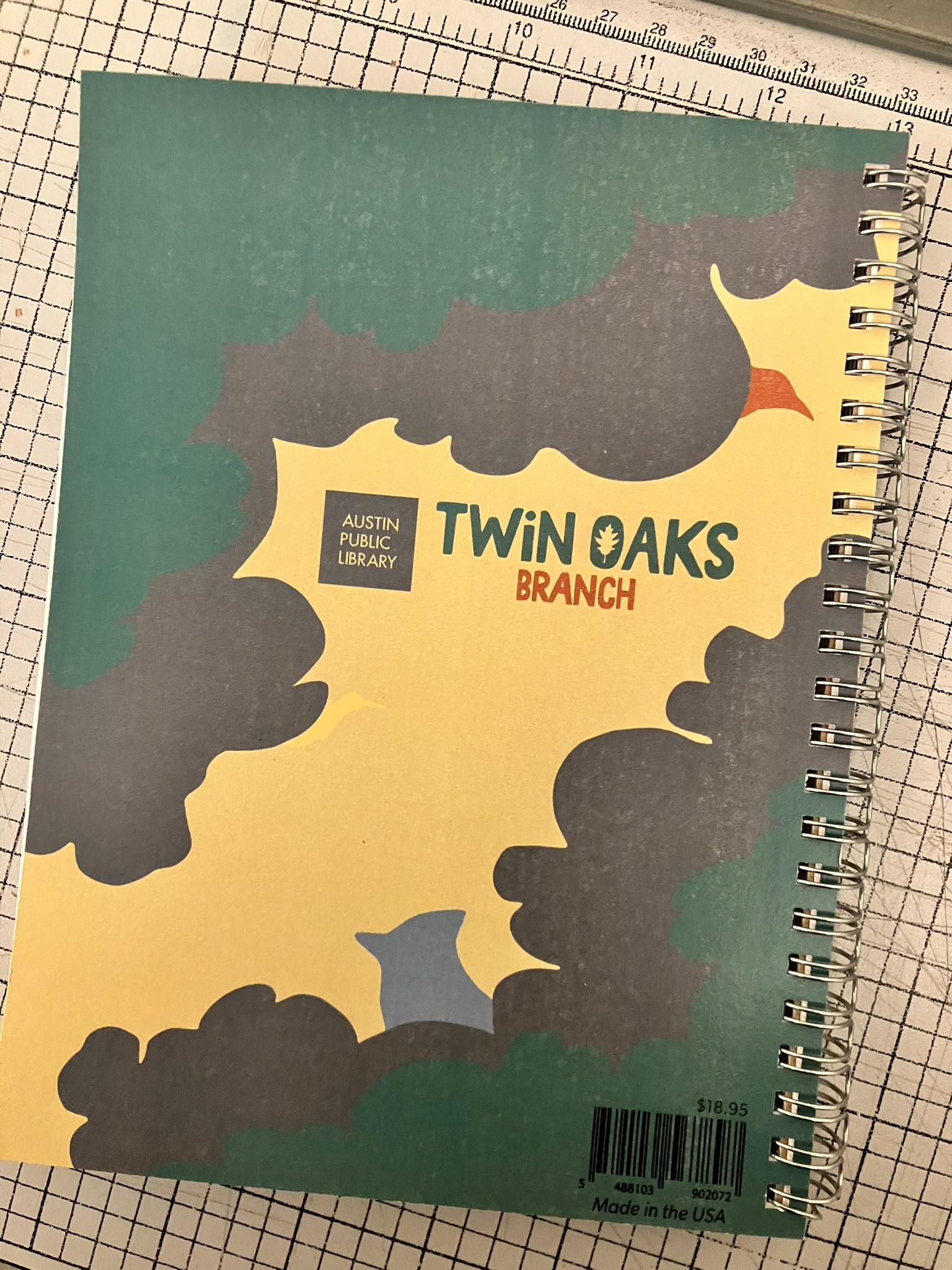
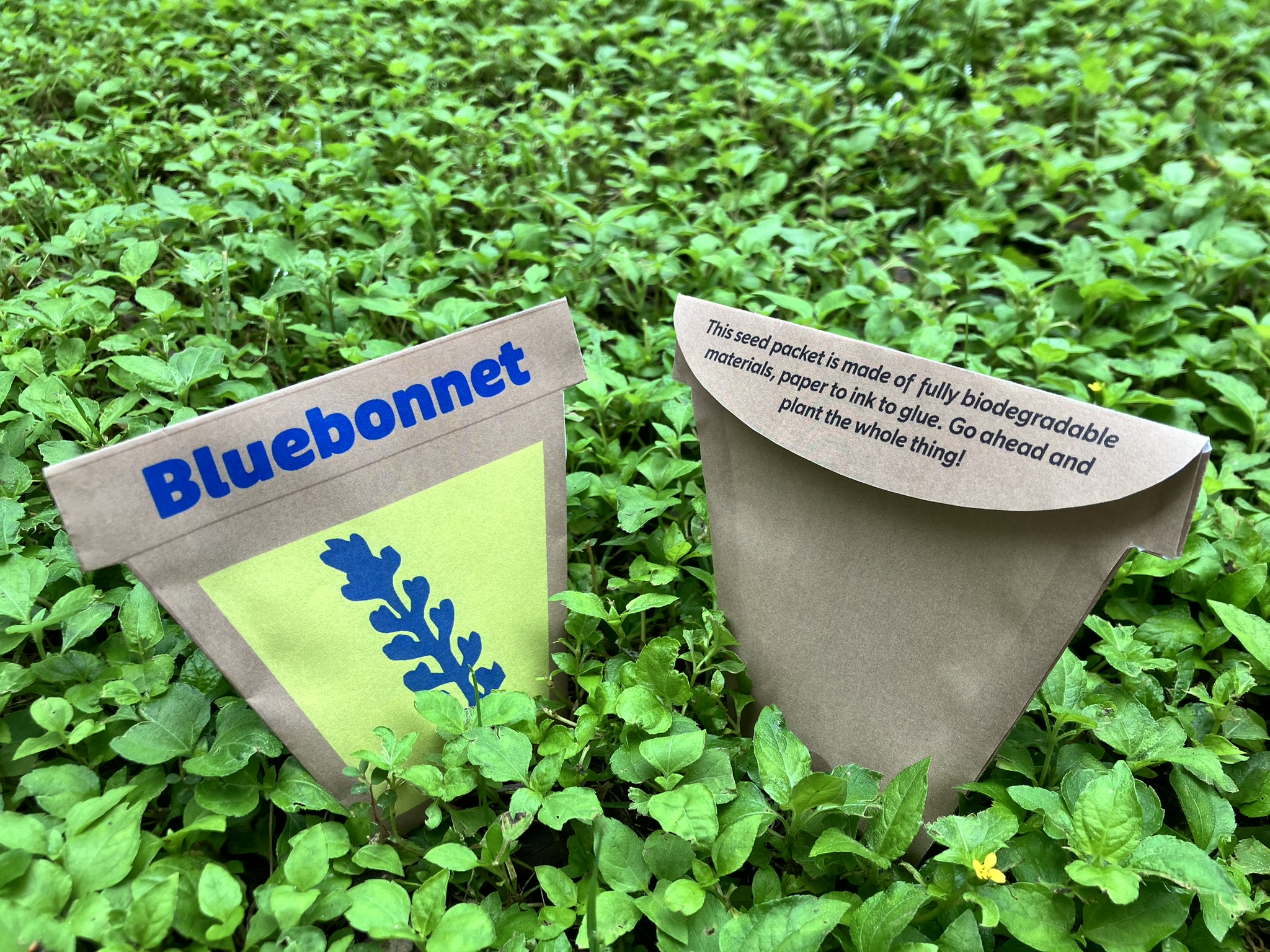
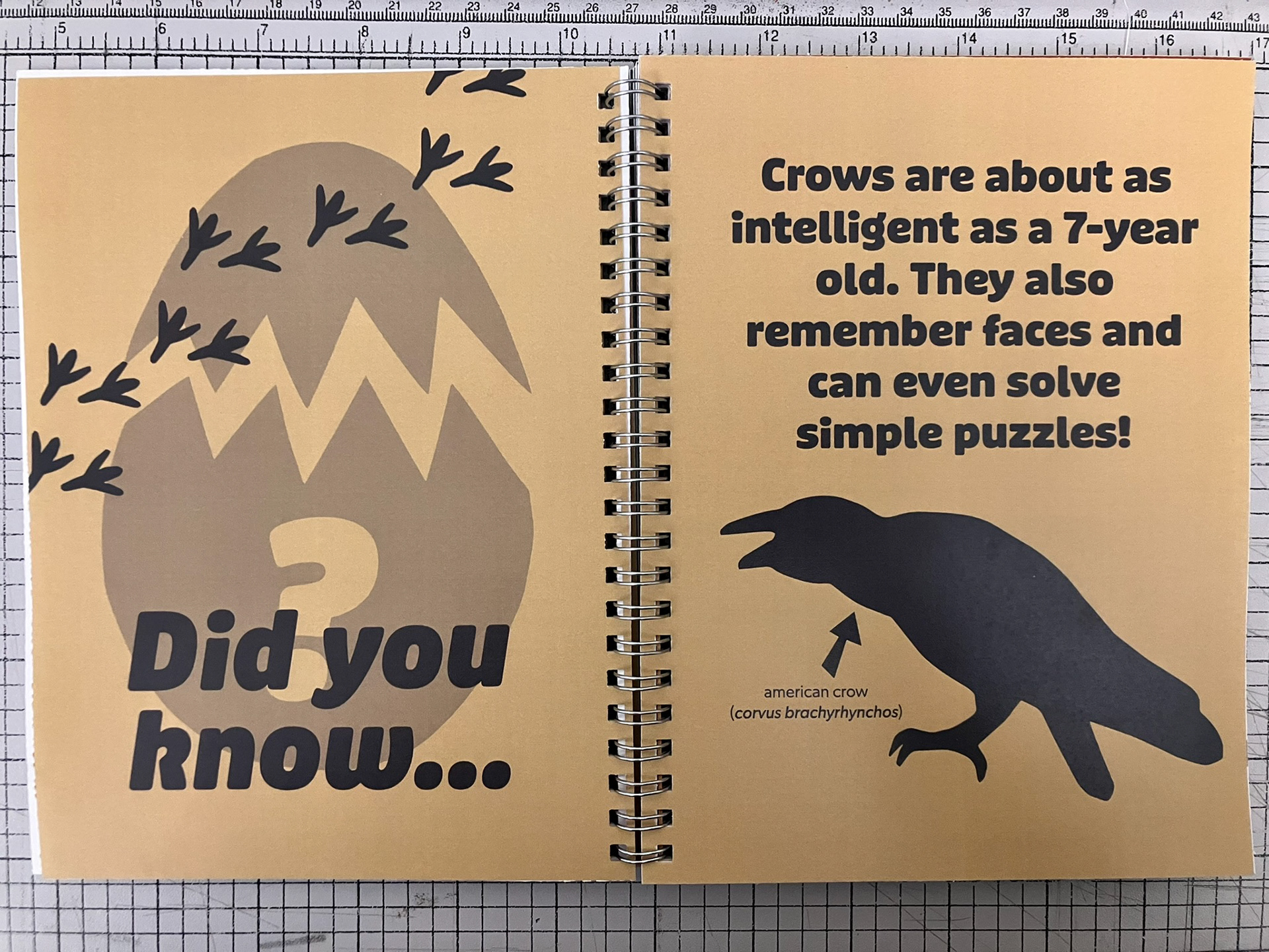
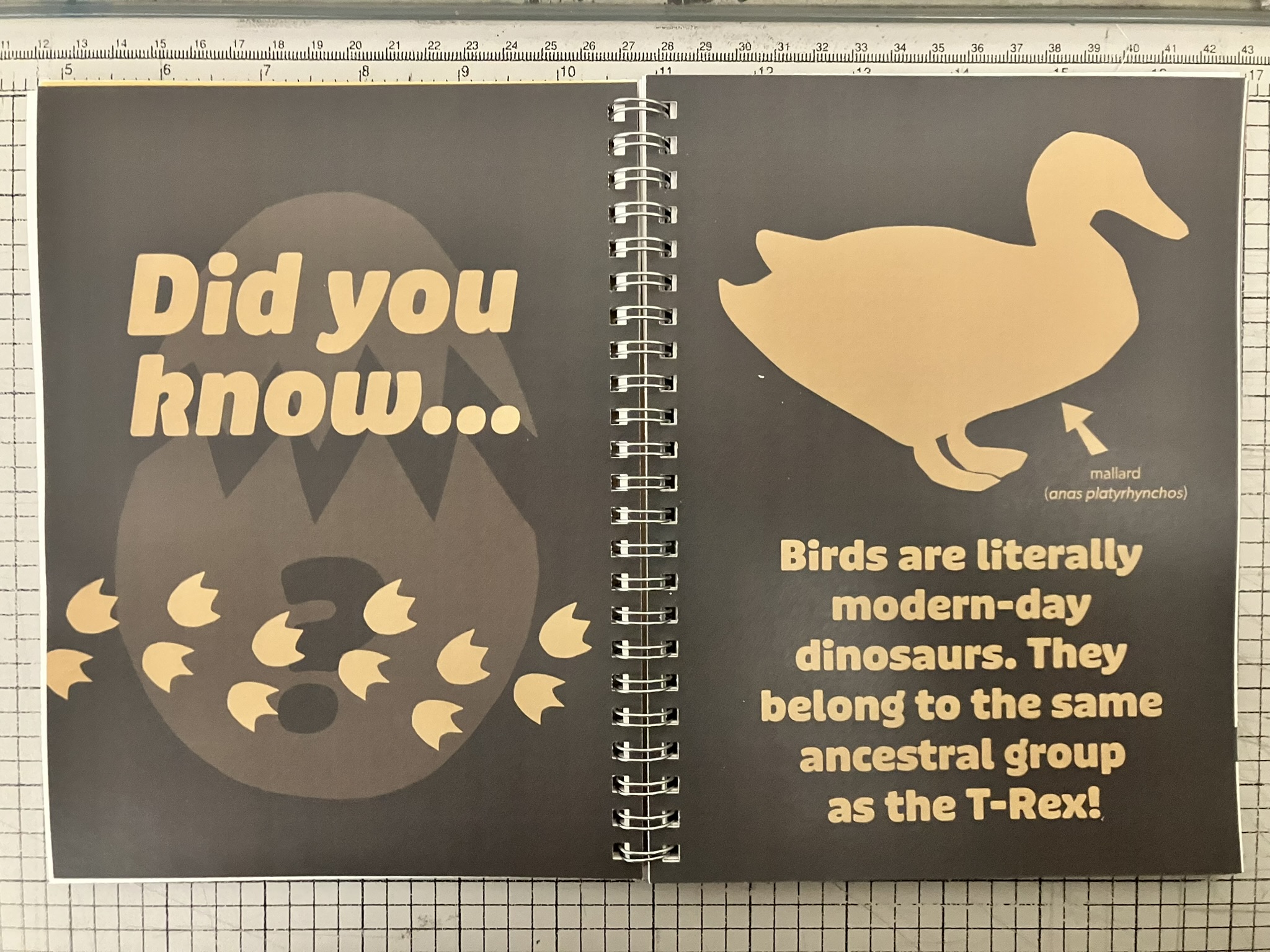
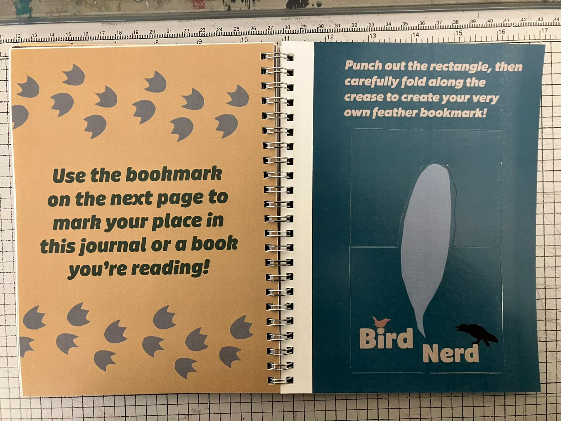
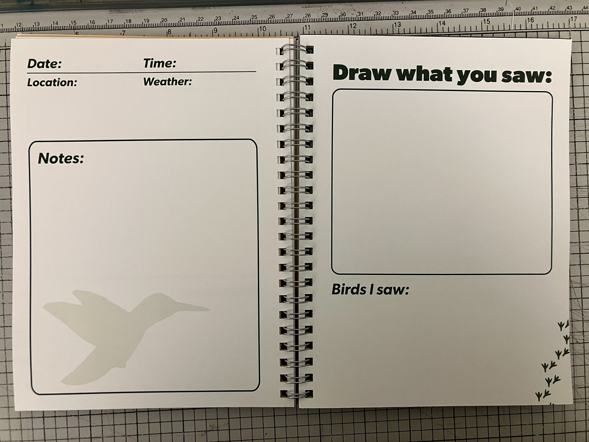
Proposed brand material included a number of library-appropriate things, but few stood out as much as an eventual redesign of the shown seed packets and a birdwatching journal to complement the naturalist theme of the library’s identity.
Eventually, to show craftsmanship and a fleshed-out component of the materials, I created the environmentally friendly seed packets and the journal, which use as many of the brand’s elements as possible: colors, fonts, and iconic imagery. The journal includes fun facts, pages for outdoor adventures, and a removeable bookmark to retain the library aspect of the brand, rather than solely a naturalist identity.
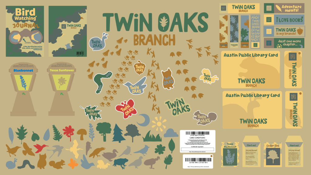
(“Megaslide” with all original designed elements)
This is definitely a project I was proud to call my own. In making a brand identity for the first time, I combined many of the things I had already learned alongside new techniques. Printed products, wordmark/logo creation, font choices, and color schemes were all vital elements in the final presentation, and the experience I gained from speaking to an audience about the story behind it all was also much more exciting than I thought it’d be. This project definitely expanded my perspective on how to design elements that can be used throughout different printed mediums, and even digital if the project required.