
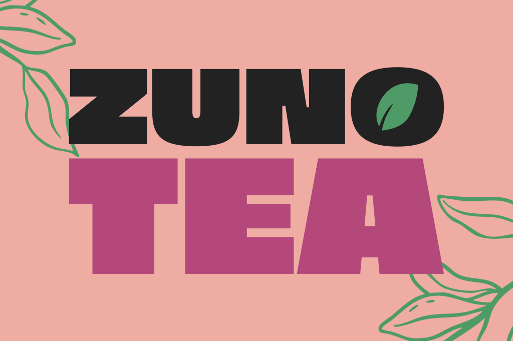
This project was completed for a design brief prompt in October 2026. The brief asked for a wordmark and logo, brand, and deliverables (product packaging, brochure/print design) for a fruit tea company with the following description:
ZUNO Fruit Teas offer a variety of unique, fair trade fruit tea blends from across the globe. Unlike many of ZUNO’s contemporaries, ZUNO are purposely trying to attract a younger audience. Fruit tea is typically considered a slightly more mature choice of drink for middle aged and older adults, but ZUNO are trying to break this perception and get younger people enjoying the healthy benefits of fruit tea!
ZUNO’s core range of best selling teas are of course your typical fruit flavours, such as lemon, strawberry, mixed berry, ginger etc. but they are also keen to push their more obscure flavours such as ‘Lemon Sherbert Iced Tea’ and ‘Very Berry Crush’.
We want you to create a fun, playful, and most importantly youthful brand identity for ZUNO. The client is keen to explore some playful pattern work or illustration to use across their product packaging. They do not want to use any photography on the packaging itself.
Explore some illustration styles and experiment with some different patterns. Once you are happy with a route, you can begin experimenting with different type lockups and brand marks. ZUNO’s brand tagline is ‘Drink Tea Everyday’. This must be incorporated in some way.
The identity and deliverables were designed in 3 days as the brief calls for.
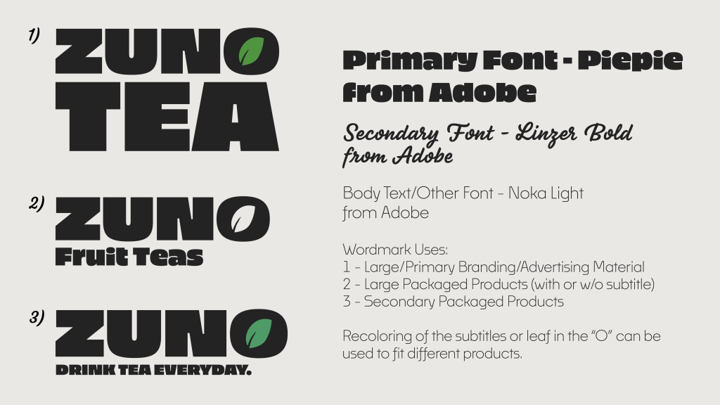
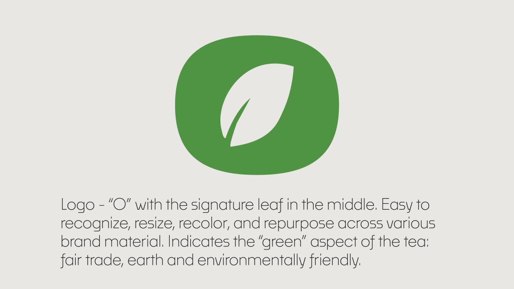
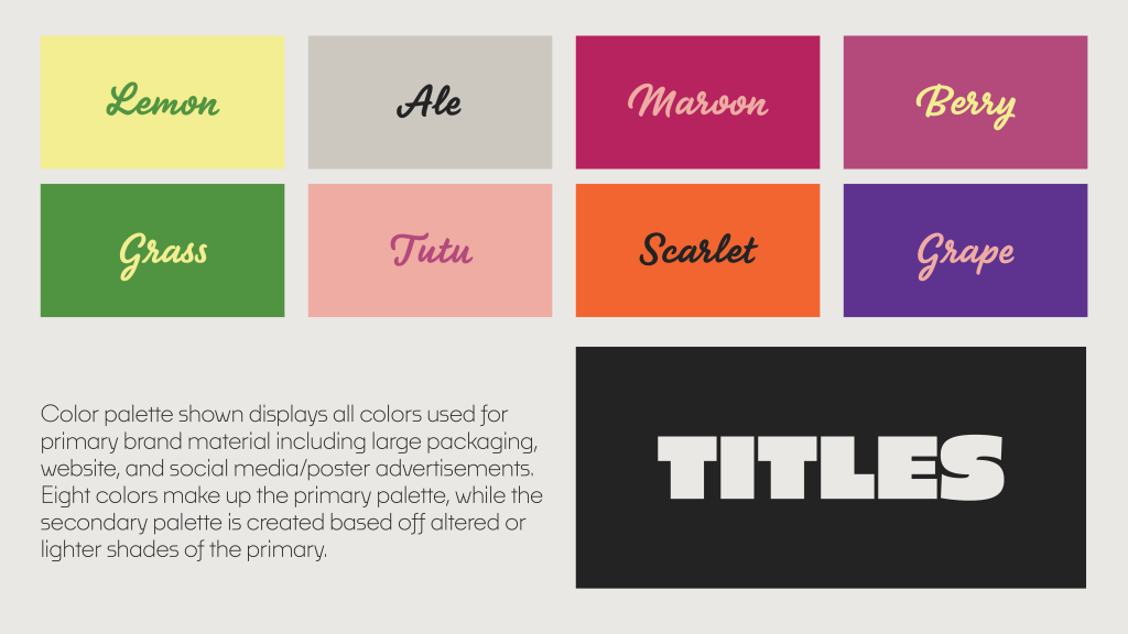
Shown above are the brand guidelines. Wordmark/Logo designs are shown along with the color palette.
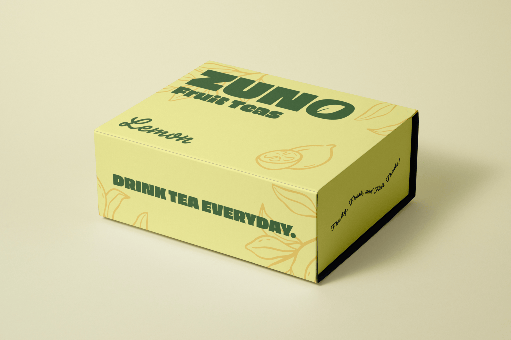
The first deliverables created were mockups for the physical tea boxes. Package designs for the boxes are shown in the following flavors below: lemon, very berry, ginger, and strawberry.
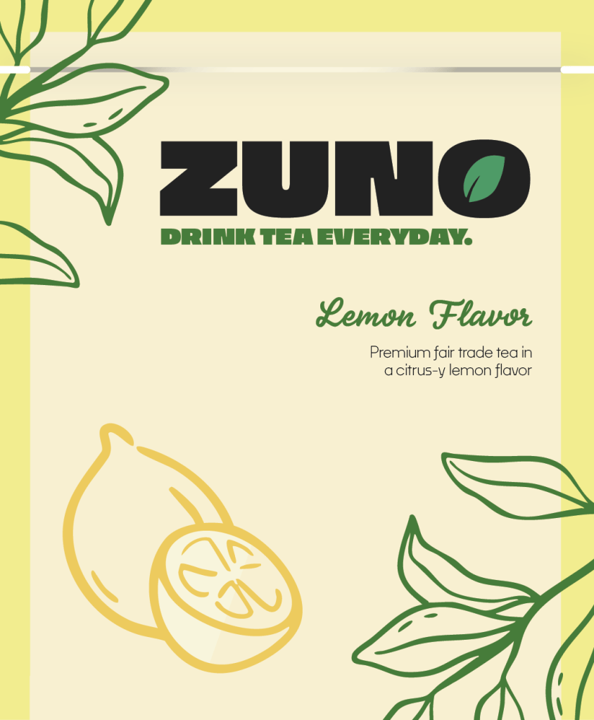
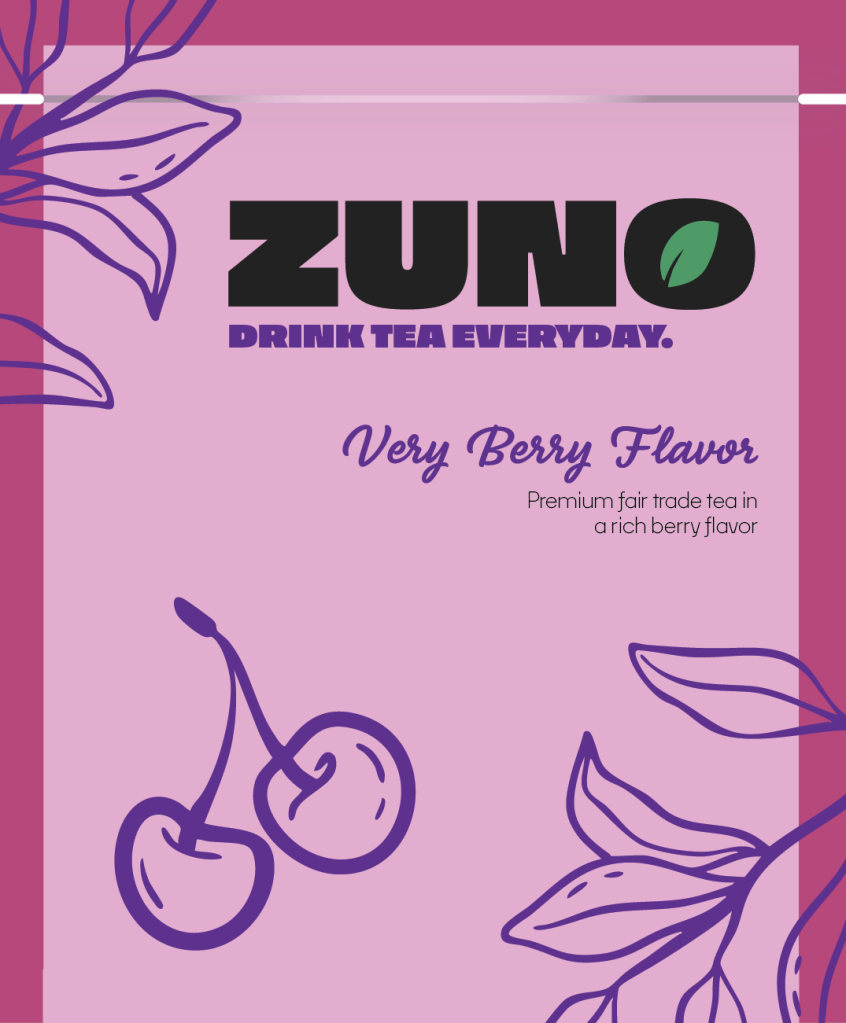
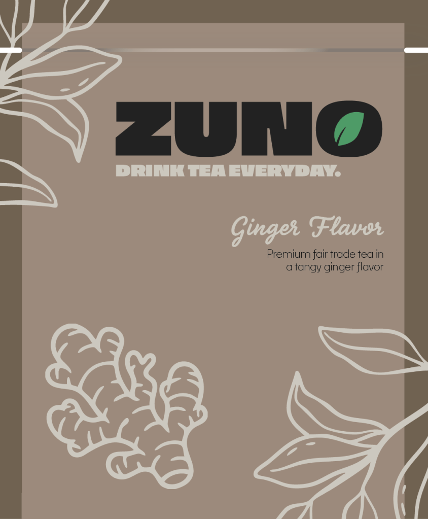
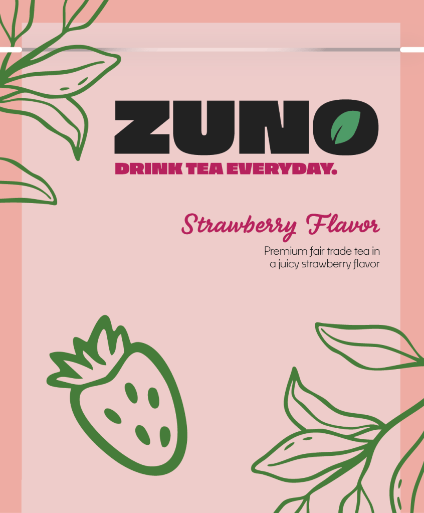
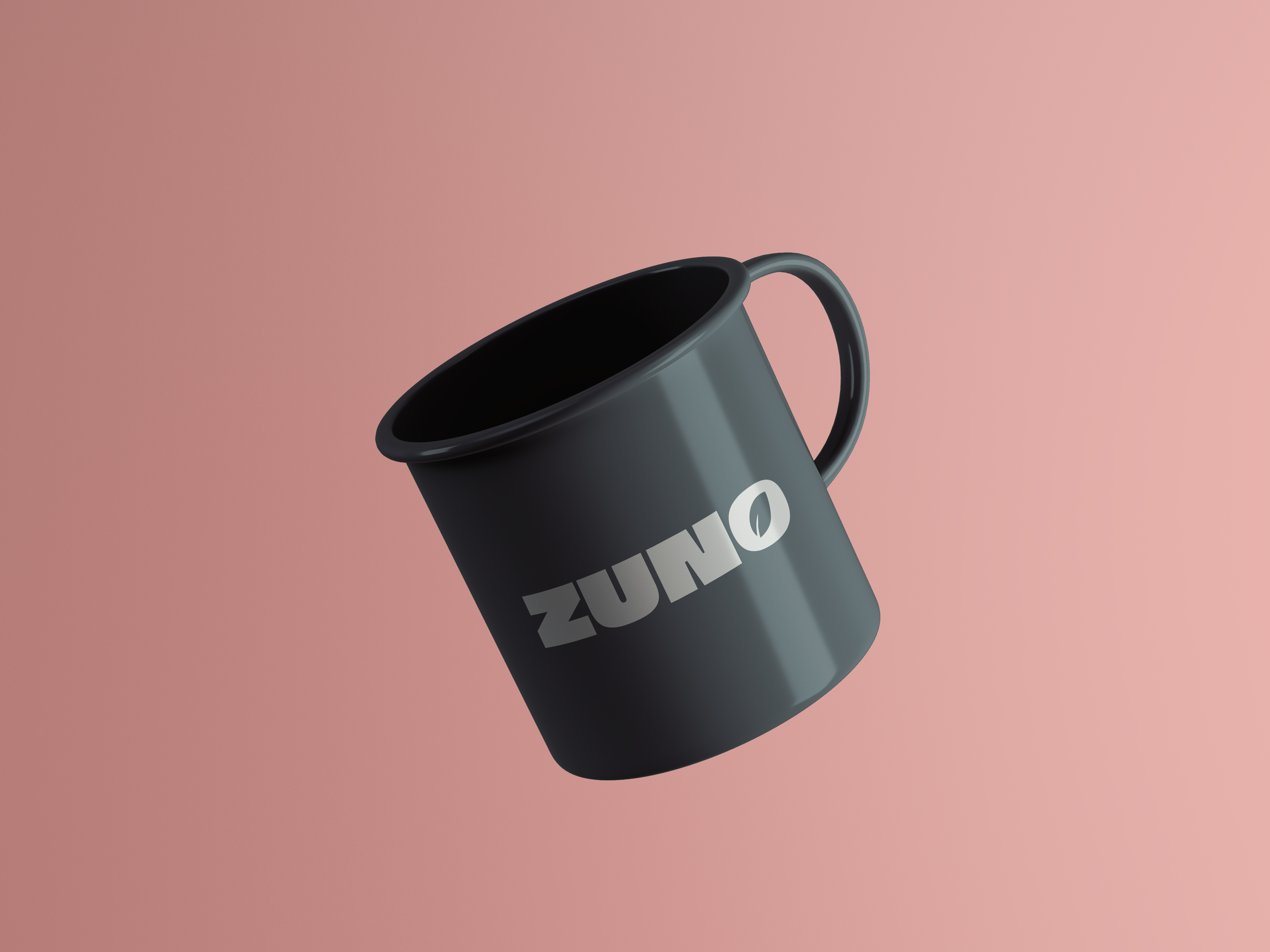
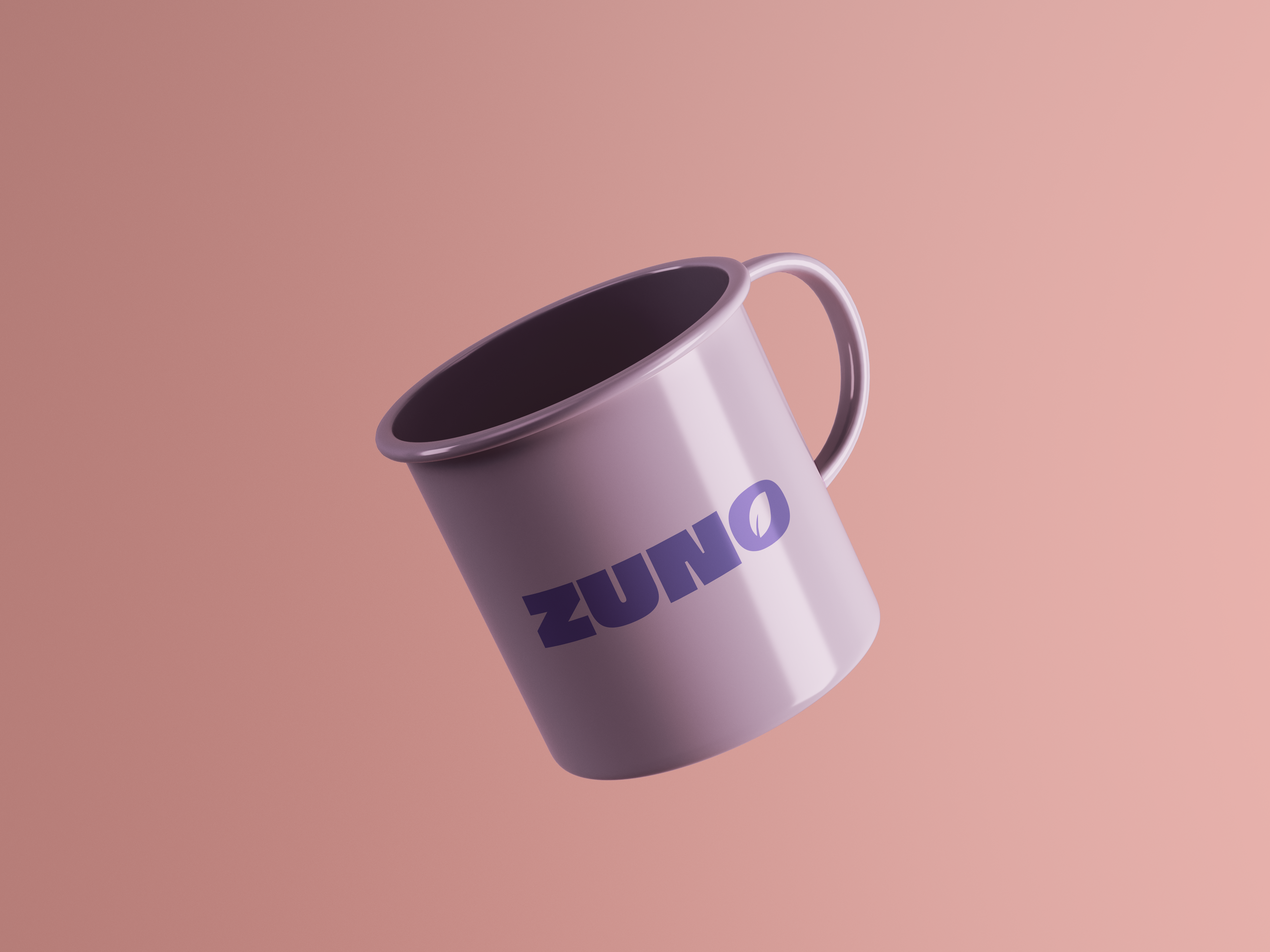
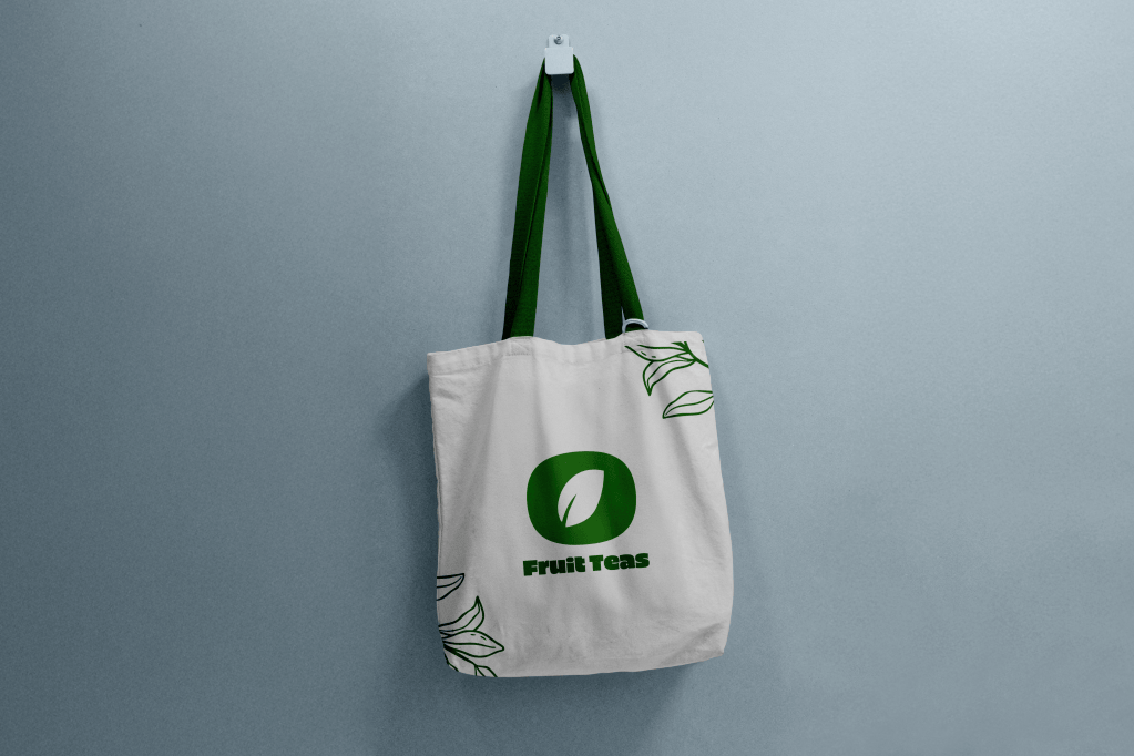
Shown above are tea sachet bag designs, each one corresponding to a different flavor box. Shown below are custom enamel-metal mugs, specially designed for hot (or cold!) servings of tea, and a tote bag for general merchandising purposes.
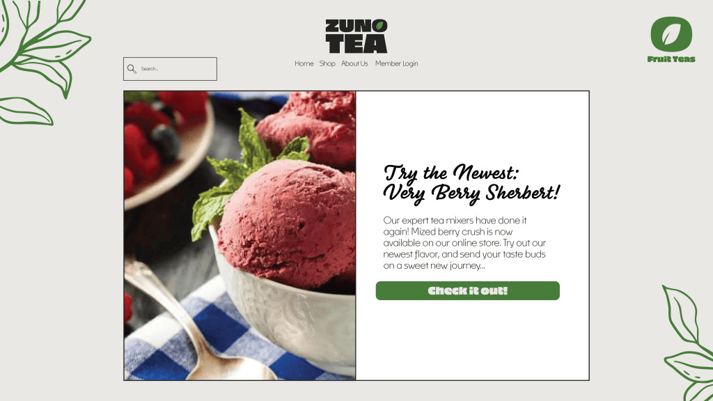
Online presence is a huge part of building a identity, especially with a food and beverage brand. No marketable brand is complete without a website, social media, and advertisements. Below is a homepage for a website, and further down is a social media post with multiple slides advertising the latest flavors. With young people being the target demographic, social media like instagram is the best place to advertise.
Many social media users rely on simplicity, directness, and a color scheme that’s easy to look at. A bit of mystery adds to the advertisements, which helps users get interested in further searching for what is being advertised to them. When considering language aimed towards this demographic, it is generally better to keep it vague, but not so much so that the user does not know what the product being advertised is. The advertisement below exemplifies this.

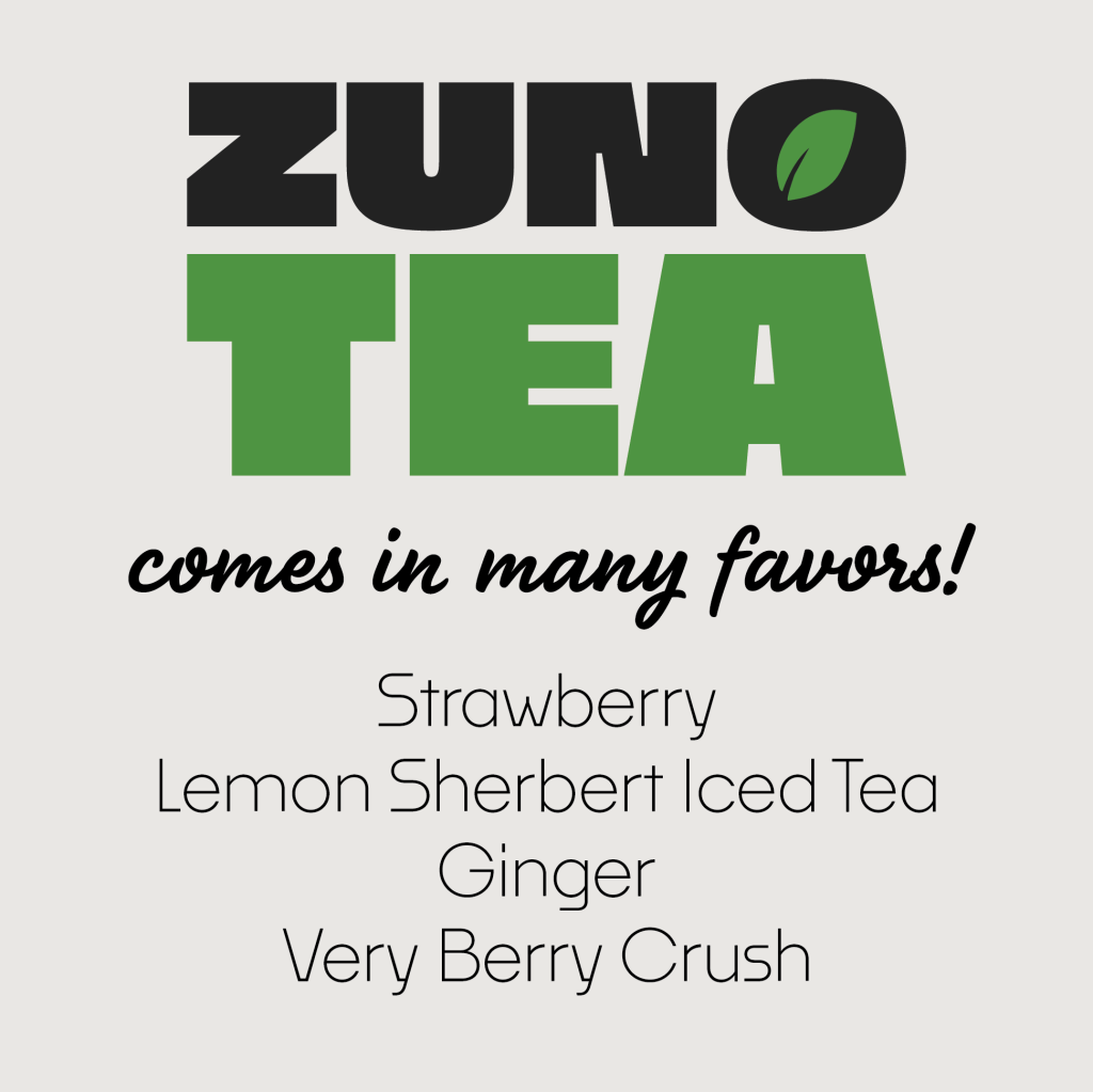
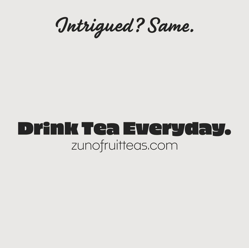
A strong company identity relies on deliverables, social media advertisements, and simple, easy-to-read/understandable materials. With the brief’s identity goal in mind, I created a straightforward, playful, yet sophisticated brand identity for ZUNO’s Fruit Teas. This brand is illustrative, playful, health-focused, and youthful in spirit, emphasizing the tagline “drink tea everyday.”

